Kate Sonneveld, RMT
Mini brand identity created for a local Registered Massage Therapist. The project focused on developing a calm, natural visual identity through a custom logo, soothing colour palette, and branded collateral for client-facing materials.
- Scope — Mini Brand Identity
- Industry — Health & Wellness
- Deliverables — Logo, colour palette, notebook cover, essential oils label, business cards
Logo Variations
The identity includes primary and reversed logo treatments designed for flexible use across print, packaging, and digital applications.
Primary Logo
Reverse Logo
Colour Palette
Earthy greens and soft neutrals were chosen to evoke calm, balance, and nature.
#1E4630
#3F6F57
#E6E2CF
#F5EFE5
Typography
Soft rounded typography paired with a clean sans-serif to maintain a calm and approachable tone.
Logo Mark
KS Monogram

Custom hand-lettered monogram.
Supporting Typeface
Red Hat Text
Aa
ABCDEFGHIJKLMNOPQRSTUVWXYZ
abcdefghijklmnopqrstuvwxyz
Brand Applications
The identity was applied across essential client touchpoints including packaging, print collateral, and promotional materials.
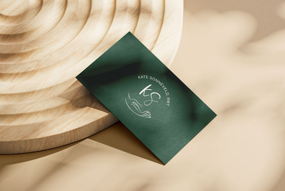
Business Cards
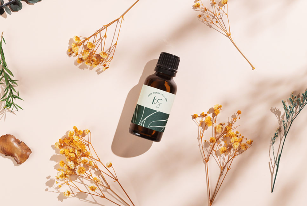
Essential Oil Label
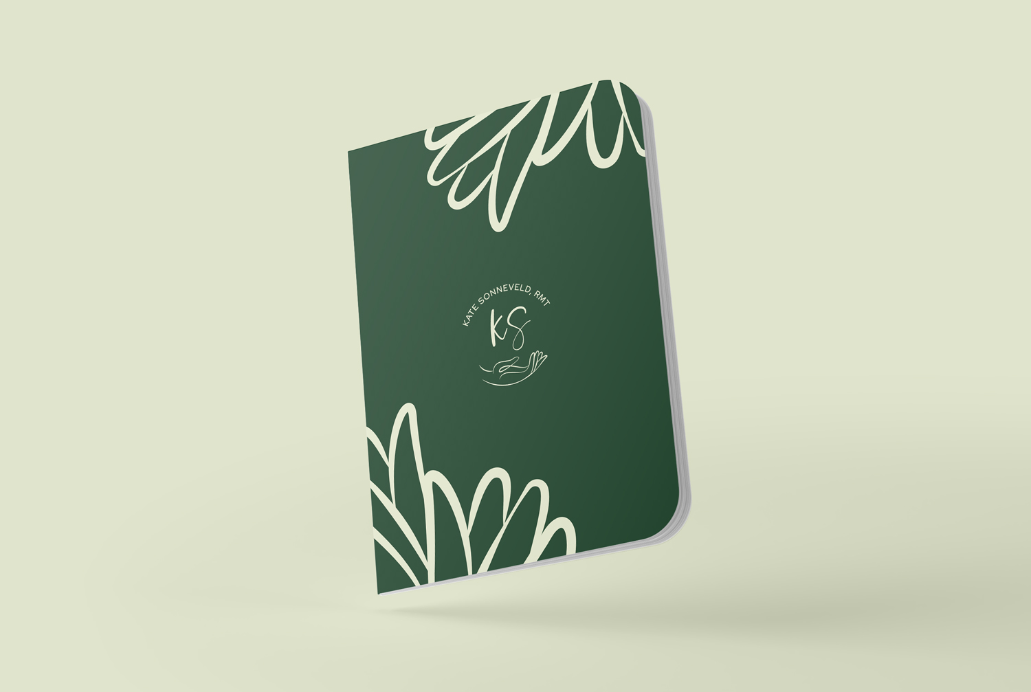
Notebook Cover